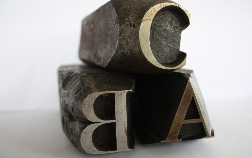
Stanley Nelson leans over a small folding table inside New York City’s Grolier Club, America’s oldest and largest society for bibliophiles. Wrapped in an apron, the retired graphic arts specialist from the National Museum of American History lays out candles, file tools, and punches. He folds his fingers around a three-dimensional letter form and strikes it into small copper slabs which create molds from which he will cast type letters individually; the type caster picks up a ladle to scoop lead amalgam, pours it into the hollowed-out block, and once solid, breaks the small frame open to extract the letter—a perfect fourteen point font “t”.
After filing the sharp edges of his new typeface, he passes it around. Lifting his round reading spectacles, he begins scanning the faces of two dozen retired collectors of fine books, students of printing arts and professionals of library, information and academic services. “Five or six types a minute, that’s how fast they could cast type in those days,” remarks Nelson jovially, explaining that standard reading types were cast from lead or brass, larger ones from sand or wood, “for posters of legislative bills.”
His demonstration sheds light on the typography method of cutting letter punches in steel, from which matrices were made in copper for types founding in the letterpress era. The matrices begun as blank pieces of copper that received the impress of the punch, he explains, and corrected to make the plumb, with smooth surfaces. The type caster inserted the finished matrices into a mold, for casting its specific type sort in a lead amalgam. Cutting punches and casting type was the first step of traditional typesetting that was regarded as a highly skilled craft. It required patience to work with movable and hot components, he adds, noting that “most taught themselves,” with the exception of Claude Garamond, French punch-cutter whom learned from someone else, most likely a master in his profession.
A large well-dressed group assembled earlier at the French Institute across the street to attend lectures on the Imprimerie Nationale de France and its Atelier du Livre d’Art et de l’Estampe, one of the most prestigious printing houses in Europe. It possesses over half a million historical artifacts that include punches with seven hundred different alphabet types. It retains a printing historical library that stores thousands of specialty books on its techniques and hundreds of Greek and Latin dictionaries, printed on order by late Napoleon Bonaparte. It also runs a workshop, and preserves ancient etching, engraving, lithographic, and collotype press machines, once used by Spanish surrealist painter Salvador Dalí and most notably, French artist and printmaker Henri Matisse.
Selected book historians, typographers and other specialists presented the institution’s exhaustive history by analyzing its significance on book and printing arts dating to fifteenth century France. Some experts, including Nelson, claim that the French kingdom gave birth to the world’s prestigious book institutions, noting that the manual printing press, pressurized application of an inked surface resting upon a print medium, first arrived to France in 1417. But historical records reference German goldsmith Johannes Gutenberg, who was crowned the device’s rightful inventor two decades later in the Holy Roman Empire.
Regardless of the historical reference, printing houses and artisan workshops in France trained and hired typographers and punch cutters, relying on their skill sets. National municipal libraries lectured book keepers and curators, and supported research in printing, cataloguing and bibliography. The French institutional strength was soon replicated in other European countries and abroad, holding its prestige to this day.
The hand press became a state affair by the sixteenth century with noble families managing the enterprise. Noblemen set up services in offices under the roof of the Musée du Louvre, in Paris. Renaissance monarch King Francis I ordered a meticulous translation of Greek and Latin texts, the core of his prized collection. The fanatic lover of the arts commissioned Garamond—“Garamont,” in French—to create a Greek typeface for his bureaucratic documents, and soon the punch cutter became a national celebrity and valuable brand. The king also assigned his librarian at the royal Palace of Fontainebleau, outside of Paris, to catalogue the manuscripts after they were copied and printed.
By the early nineteenth century the hand press reached Constantinople. Napoleon’s geographical expansion introduced to Europeans engravings and compositions that supported hundreds of new languages and dialects. The Emperor built a department dedicated to collecting rare artifacts, Chinese characters and other non-Latin typefaces. It also included his scholarly enterprise from Egypt, housing the state’s historical monuments, from the earliest forms of woodblock printing to a copy of the Rosetta Stone.
The end of the century marked the beginning of mechanical methods of punch cutting and typesetting. Book workers squelched the new innovation, by damaging their machines and protesting in the streets. The introduction of flexography, an updated version of the letter press, utilized flexible relief plates applied to plastics, metallic films, cellophane and paper. Flexographic prints today are used on food labels. Inkjet printing was also introduced, but because of limited technology, the process lost its popularity.
Modern history of the printing press and its archive is one of triumphal survival. In light of the Imprimerie Nationale turning a little over five hundred years old, director Didion Trutt offers a proposition. “It is our duty to maintain historical records… these treasures are alive,” contends the engineer by profession. The institution’s full staff of native and foreign graphic designers, housed in a Parisian suburb, work on Apple computers to modify font and character. They design state identification cards and other important documents that computer programmers later archive digitally. Nelson’s friend, an independent programmer, practices on the Fontographer, the font software that digitally drives monotypes, forming a marriage of old and new methods to drive the full-scale production house.
Director of the Grolier Club Eric Holzenberg looks forwards to the union. After curating an exhibition on selected historical punches and matrices of various typefaces and dozens of fine books from the Imprimerie Nationale Archives, he draws unlikely conclusions. His observations prove that new technologies (like Kindle and iPhone), don’t always dwindle a young generation’s intrinsic curiosity for bookmaking. “It is our mission to raise support and interest for young people,” he says, impressed with the growing audience of passionate fine bookmakers and keepers who are using their smartphones to print books. Admitting that attendees at the French Institute were mostly retirees he shares a final note: “we are trying to find ways to change that.” But Nelson warns if we don’t act fast, negligence of weighted type will only result in a resource lost. “Type lies at the heart of fine letter press, it needs to be used,” he says, like a computer keyboard, making ‘real’ type the living standard.
Full featured article in RagMag May 2012 (PDF)
[issuu width=420 height=282 pageNumber=21 backgroundColor=%23222222 documentId=120605125752-10f6b5d041a04edb937424fe81fc9fb7 name=ragmag_may_2012 username=ragmag tag=cartier unit=px v=2]


